How to smoothly animate your react native app
How to create a scalable react native app - Part III

Wecome to the last post of this series 👋
What are we going to build
In the today's blog, as promised, I will show you how to give a little more peps to our note-taking app !
As always, if you haven't already, I highly recommend you to read the two other posts of this series first to get all the context. I will start from where we left off last time.
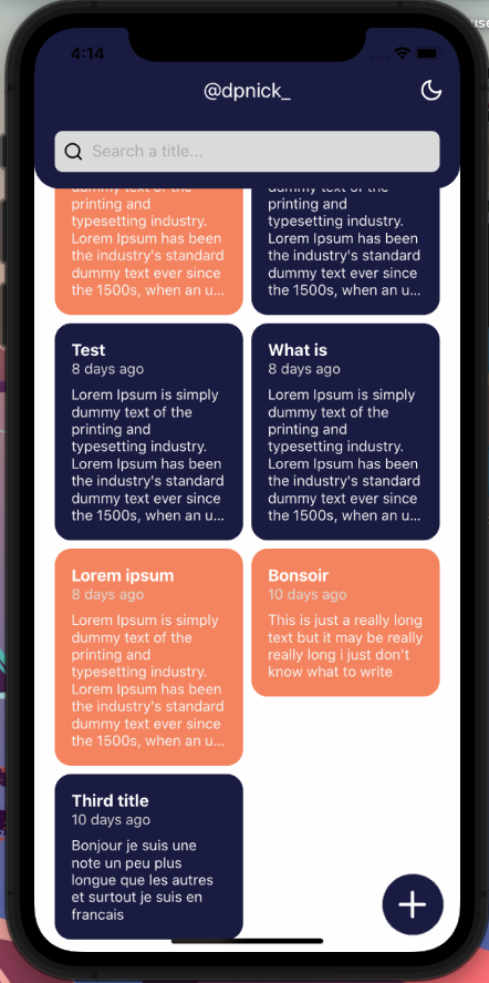
This is what we are going to build in this tutorial :
You may have noticed, there are four main animations to take care of :
- list cards (layout animation)
- scroll list
- header content
- theme
Animation disclaimer
Nowadays, animations are really important tools that make your app unique and provide your users a feeling of satisfaction. On the other hand, too much or poorly implemented animations will give your app a cheap and useless feeling.
That's why, as app developer you need to pay attention to several things :
- don't over-use animations, especially complex ones, from my point of view micro-interactions are the keys to offer your users the best experience.
- your animations must serve your design / functionalities and not the other way around.
- make sure your animations run smoothly.
React native comes with a built-in library called animated. This library is really nice while animating non-layout properties like opacity, scale and others which can use native driver.
However, when it comes to animate properties like width or padding, the animated API suffers from serious performance issues. The main reason for this is : non-native-driver animation are defined on the JS thread and need to use a bridge to reach the UI thread. You surely guessed it, native-driver animation, directly use the UI thread and are, consequently, way more performant.
If you want more informations about how Animated API works and its caveats I recommend you to read this article
This is where react-native-reanimated@2 from Software Mansion comes up.
Reanimated 2
To keep it simple this (wonderful) library provides a way to declare your animation in JS but to have them all running on the UI thread. This means a huge performance increase.
It also provide a really nice API to manage gesture events, layout animations, ...
Reanimated 2 is available for expo since the SDK 44 only, before continuing make sure your project is up to date with this version !
Installation
Before starting we need to install and configure reanimated :
expo install react-native-reanimated
Then add the babel plugin :
module.exports = function (api) {
  api.cache(true);
  return {
    presets: ['babel-preset-expo'],
    plugins: [
      'babel-plugin-styled-components',
      [
        'module-resolver',
        {
          root: ['./src'],
          extensions: ['.ios.js', '.android.js', '.js', '.ts', '.tsx', '.json'],
          alias: {
            '@components': './src/components',
            '@navigation': './src/navigation',
            '@contexts': './src/contexts',
            '@models': './src/models',
            '@hooks': './src/hooks',
            '@pages': './src/pages',
          },
        },
      ],
      'react-native-reanimated/plugin',
    ],
  };
};
If you load other Babel plugins, the Reanimated plugin has to be the last item in the plugins array.
Restart your app and clean the cache with the following :
expo start -c
Congrats you can now build amazing animations 🤪
Card layout animation
Reanimated layout animation is a convenient way to provide component smooth entering / exiting / layout animations. It is especially useful if you have a filtrable / sortable list with moving items just like we do with our notes.
Go ahead and update your NoteCard component as bellow :
// src/components/NoteCard.tsx

+ // animated component can either be created using this method
+ // or directly in your template like <Animated.View>
+const AnimatedStyledView = Animated.createAnimatedComponent(StyledView);

export default function NoteCard({
  note,
  showNoteEdit,
  ...props
}: NoteCardProps) {
  const showDetail = () => showNoteEdit(note.id, note.title);

  return (
    <Pressable
      onPress={showDetail}
      style={({ pressed }) => ({ opacity: pressed ? 0.7 : 1 })}
    >
+      <AnimatedStyledView entering={FadeInUp} exiting={FadeOutDown} {...props}>
-      <StyledView {...props}>
        <StyledText
          color='white'
          numberOfLines={1}
          fontWeight='bold'
          fontSize={2}
        >
          {note.title}
        </StyledText>
        <StyledText color='accent' mb={8}>
          {formatDistanceToNow(note.updatedAt, {
            addSuffix: true,
          })}
        </StyledText>
        <StyledText color='whitesmoke' numberOfLines={8}>
          {note.content}
        </StyledText>
+      </AnimatedStyledView>
-       </StyledView>
    </Pressable>
  );
}
Reanimated comes with a lot of predefined layout animation. For example you can replace
FadeInUpwithBounceIn. You can found a full list of animations here
And this is all that it takes! Try your app, search some notes, you should know have a nice fade in up entering and fade out down exiting animations ! 🎉
Scroll animation
In case of the user having a lot of notes, we want him to be able to see them all easily. To do so, we'll use the scroll event from our ScrollView to make our header "shrinkable". At the same time we'll move our SearchBar component to be part of the header when in the "shrink" state.
First, let's define some layout variables we are going to use to build our animations. Create a new file models/layout.ts and paste the following content inside :
export const SEARCH_BAR_HEIGHT = 40;
export const PADDING_TOP_BAR = 16;
export const HEADER_FULL_HEIGHT = 300;
export const HEADER_MIN_HEIGHT = 100 + SEARCH_BAR_HEIGHT + PADDING_TOP_BAR;
export const HEADER_SCROLL_DISTANCE = HEADER_FULL_HEIGHT - HEADER_MIN_HEIGHT;
💡 To be able to test while creating your animation, make sure to have enough notes to scroll.
Home page
In this component, we are going to get the vertical content offset from the scroll event emitted by the ScrollView. Once done, we are going to provide it to other components that need it (Header and SearchBar).
(check code comments)
// src/pages/Home.tsx
// ...imports
const StyledScrollView = styled.ScrollView<LayoutProps & SpaceProps>(
  compose(layout, space)
);

+const AnimatedScrollView = Animated.createAnimatedComponent(StyledScrollView);

export type HomeProps = NativeStackNavigationProp<HomeStackParamList, 'Home'>;

-const SEARCH_INPUT_HEIGHT = 40;
-const PADDING_VERTICAL_SEARCH = 32;

export default function Home() {
  const { notes } = useNote();
  const [isLoading, setIsLoading] = useState<boolean>(true);
  const [filteredNotes, setFilteredNotes] = useState<Note[]>([]);
  const [search, setSearch] = useState<string>('');
  const debouncedSearch = useDebounce<string>(search, 500);

  useEffect(() => {
    if (!notes) return;
    setFilteredNotes(notes);
    setSearch('');

    setTimeout(() => setIsLoading(false), 3000);
  }, [notes]);

  useEffect(() => {
    if (!notes) return;
    const nextData = notes.filter((note) =>
      note.title.toLocaleLowerCase().includes(search.toLocaleLowerCase())
    );
    setFilteredNotes(nextData);
  }, [debouncedSearch]);

+ // create a value that can be shared / used both on UI and JS threads
+ // used to hold animation value / progress
+  const headerScroll = useSharedValue(0);

+ // scroll event handler reference
+  const scrollHandler = useAnimatedScrollHandler((event) => {
+    headerScroll.value = event.contentOffset.y;
+  });

  return (
    <StyledView flex={1} alignItems='center' backgroundColor='background'>
-      <StyledScrollView
+      <AnimatedScrollView
        width='100%'
        px={16}
        contentContainerStyle={{
-          paddingTop: HEADER_FULL_HEIGHT + SEARCH_INPUT_HEIGHT + PADDING_VERTICAL_SEARCH,
+          paddingTop: HEADER_FULL_HEIGHT + SEARCH_BAR_HEIGHT + PADDING_TOP_BAR * 2,
        }}
+        keyboardShouldPersistTaps='never'
+        onScroll={scrollHandler}
+        scrollEventThrottle={16}
+        bounces={false}
      >
        <MasonryList
          notes={filteredNotes}
          search={search}
          isLoading={isLoading}
          userHasNotes={!!notes && notes?.length > 0}
        />
-      </StyledScrollView>
+      </AnimatedScrollView>
      {notes && notes?.length > 0 && (
        <SearchBar
          value={search}
          onChangeText={setSearch}
          placeholder='Search a title...'
+          scroll={headerScroll}
        />
      )}
      <CreateButton />
-      <Header />
+      <Header scroll={headerScroll} />
    </StyledView>
  );
}
Header
Now, we need to update our component to be able to use the new prop passed by the parent (named scroll). Then, we will animate our component style according to the scroll value.
(more explanations below)
// src/components/Header.tsx
const TWITTER_NAME = '@dpnick_';
-export const HEADER_FULL_HEIGHT = 300;

+const AnimatedHeaderView = Animated.createAnimatedComponent(StyledView);

+interface HeaderProps {
+  scroll: Animated.SharedValue<number>;
+}

- export default function Header() {
+ export default function Header({ scroll }: HeaderProps) {
  const { isDarkTheme, switchTheme } = useContext(ThemeContext);

  const openTwitter = async () => {...};

+ // animated style based on scroll shared value from parent
+  const headerAnimatedStyle = useAnimatedStyle(() => {
+    const height = interpolate(
+      scroll.value,
+      [0, HEADER_SCROLL_DISTANCE],
+      [HEADER_FULL_HEIGHT, HEADER_MIN_HEIGHT],
+      Extrapolate.CLAMP
+    );
+    const borderRadius = interpolate(
+      scroll.value,
+      [0, HEADER_SCROLL_DISTANCE],
+      [48, 24],
+      Extrapolate.CLAMP
+    );
+    return {
+      height,
+      borderBottomRightRadius: borderRadius,
+      borderBottomLeftRadius: borderRadius,
+    };
+  });

  return (
-    <StyledView
+    <AnimatedHeaderView
      bg='primary'
      position='absolute'
      width='100%'
      justifyContent='center'
+      style={headerAnimatedStyle}
    >
      <StyledView padding={4}>
        <StyledText fontSize={6} color='white'>
          Welcome
        </StyledText>
        <Pressable
          onPress={openTwitter}
          style={({ pressed }) => ({ opacity: pressed ? 0.3 : 1 })}
        >
          <StyledText fontSize={6} color='secondary' paddingLeft={36}>
            {TWITTER_NAME}
          </StyledText>
        </Pressable>
      </StyledView>
      <StyledView
        position='absolute'
        top={(StatusBar.currentHeight || 40) + 8}
        right={16}
      >
        <Pressable
          onPress={switchTheme}
          hitSlop={16}
          android_ripple={{ borderless: true, color: 'white' }}
          style={({ pressed }) => ({ opacity: pressed ? 0.3 : 1 })}
        >
          <Feather
            name={isDarkTheme ? 'sun' : 'moon'}
            size={24}
            color='white'
          />
        </Pressable>
      </StyledView>
-    </StyledView>
+    </AnimatedHeaderView>
  );
}
💡 As you may have noticed we used a hook called useAnimatedStyle. It is one of the most important piece of Reanimated. It allows you to create an association between a shared value and your animated component properties.
In this hook we are animating both the height and border radius of our header according to the actual scroll value from the parent.
"But wait... how to find a corresponding value between the header height and the scroll value ?"
Let's decrypt an example from our code:
    const height = interpolate(
      scroll.value, // shared value to apply the interpolate
      [0, HEADER_SCROLL_DISTANCE], // input range
      [HEADER_FULL_HEIGHT, HEADER_MIN_HEIGHT], // output range
      Extrapolate.CLAMP // extrapolation type
    );
We used an interpolate function. It allows us to convert an input range (in our case the scroll value) to an output one (corresponding header size). We defined bounds (min and max) for each range, each value between will be proportional. Thanks to the clamp extrapolation every value outside of our bounds will be ignored.
So in plain words it would give the following :
- when the scroll value is 0 we want the header to display full height.
- as soon as you start scrolling the header height must change accordingly.
- once you hit the total scroll distance, it means the height of your header is at its min height and won't reduce more.
(same principle in the other way)
From now on, you are officially able to create scrolling-aware animations 🚀
Search bar
It will be very similar to what we did just before for the header. If you feel confident enough, try it by yourself, the best way to learn is by getting your hands dirty. Don't worry I will still include my solution below 😄
The animation we want to build for this component is about translateY property : when the user scroll, the search bar must move with our header. At the end of the scroll the search bar must be inside the header as you can see here :
My solution (of course, others are possible) :
// src/components/SearchBar.tsx
interface SearchBarInterface {
  value: string;
  onChangeText: (next: string) => void;
  placeholder: string;
+  scroll: Animated.SharedValue<number>;
}

+const AnimatedSearchView = Animated.createAnimatedComponent(StyledView);

export default function SearchBar({
  value,
  onChangeText,
  placeholder,
+  scroll,
}: SearchBarInterface) {

+  const searchAnimatedStyle = useAnimatedStyle(() => {
+    const translateY = interpolate(
+      scroll.value,
+      [0, HEADER_SCROLL_DISTANCE],
+      [
+        HEADER_FULL_HEIGHT + PADDING_TOP_BAR,
+        HEADER_MIN_HEIGHT - SEARCH_BAR_HEIGHT - PADDING_TOP_BAR,
+      ],
+      Extrapolate.CLAMP
+    );
+    return {
+      transform: [{ translateY }],
+    };
+  });

  return (
-    <StyledView
+    <AnimatedSearchView
      px={20}
      pb={16}
+      zIndex={1}
      width='100%'
      position='absolute'
+      style={searchAnimatedStyle}
+      backgroundColor='transparent'
    >
      <StyledView
        bg='accent'
        borderRadius={8}
        flexDirection='row'
        justifyContent='flex-start'
        alignItems='center'
        height={40}
      >
        <Feather
          name='search'
          size={20}
          color='black'
          style={styles.iconStart}
        />
        <TextInput
          style={styles.input}
          placeholder={placeholder}
          value={value}
          onChangeText={onChangeText}
        />
        {value?.length > 0 && (
          <Feather
            name='x'
            size={24}
            color='black'
            style={styles.iconEnd}
            onPress={() => onChangeText('')}
          />
        )}
      </StyledView>
-    </StyledView>
+    </AnimatedSearchView>
  );
}
After that you should have animation very close to what we are aiming for ! But as you can see, our welcome message doesn't fit our header in "shrink" state. Let's take care of it!
Header content
The objective of this animation is the replace the header content when in "shrink" state.
After experimenting a little bit around it, the best user experience (to me at least) seems to be as follow :
- display the "full" title until reaching half our scrolling distance
- at this same distance, start displaying progressively our "shrink" title
// src/components/Header.tsx
// omitted previous code for conciseness

const AnimatedHeaderView = Animated.createAnimatedComponent(StyledView);
+const AnimatedText = Animated.createAnimatedComponent(StyledText);

interface HeaderProps {
  scroll: Animated.SharedValue<number>;
}

export default function Header({ scroll }: HeaderProps) {
  // omitted previous code for conciseness

+  const titleOpacity = useAnimatedStyle(() => {
+    const opacity = interpolate(
+      scroll.value,
+      [0, HEADER_SCROLL_DISTANCE / 2],
+      [1, 0],
+      Extrapolate.CLAMP
+    );

+    return {
+      opacity,
+    };
+  });

+  const reverseTitleOpacity = useAnimatedStyle(() => {
+    const opacity = interpolate(
+      scroll.value,
+      [HEADER_SCROLL_DISTANCE / 2, HEADER_SCROLL_DISTANCE],
+      [0, 1],
+      Extrapolate.CLAMP
+    );

+    return {
+      opacity,
+    };
+  });

  return (
    <AnimatedHeaderView
      bg='primary'
      position='absolute'
      width='100%'
      justifyContent='center'
      style={headerAnimatedStyle}
    >
-      <StyledView padding={4}>
+      <AnimatedHeaderView padding={4} style={titleOpacity}>
-        <StyledText
+        <AnimatedText
+          entering={FadeInLeft.duration(1000)}
          fontSize={6}
          color='white'
        >
          Welcome
-      </StyledText>
+      </AnimatedText>
        <Pressable
          onPress={openTwitter}
          style={({ pressed }) => ({ opacity: pressed ? 0.3 : 1 })}
        >
-        <StyledText
+        <AnimatedText
+            entering={FadeInLeft.duration(1000).delay(1000)}
            fontSize={6}
            color='secondary'
            paddingLeft={36}
          >
            {TWITTER_NAME}
-      </StyledText>
+      </AnimatedText>
        </Pressable>
-      </StyledView>
+      </AnimatedHeaderView>
+      <AnimatedHeaderView
+        position='absolute'
+        top={(StatusBar.currentHeight || 40) + 8}
+        alignSelf='center'
+        style={reverseTitleOpacity}
+      >
+        <StyledText
+          color='white'
+          fontSize={3}
+        >
+          {TWITTER_NAME}
+        </StyledText>
+      </AnimatedHeaderView>
      <StyledView
        position='absolute'
        top={(StatusBar.currentHeight || 40) + 8}
        right={16}
      >
        <Pressable
          onPress={switchTheme}
          hitSlop={16}
          android_ripple={{ borderless: true, color: 'white' }}
          style={({ pressed }) => ({ opacity: pressed ? 0.3 : 1 })}
        >
          <Feather
            name={isDarkTheme ? 'sun' : 'moon'}
            size={24}
            color='white'
          />
        </Pressable>
      </StyledView>
    </AnimatedHeaderView>
  );
}
Theme animation
Our last animation will operate when the user changes the theme of the app. When clicked, the theme icon (either "moon" or "sun") should move outside of the screen, update the theme and then return to its initial position.
This animation will be a good usecase to show you how to use Reanimated helpers :
withSequenceallow to run multiple animations sequentiallywithTimingcreate a time based animation
(documentation and list of other helpers can be found here)
// src/components/Header

// omitted not-concerned code for conciseness

+const ICON_Y_OFFSET = 44;

export default function Header({ scroll }: HeaderProps) {
  const { isDarkTheme, switchTheme } = useContext(ThemeContext);
+  const themeAnim = useSharedValue(0);

+  const toggleThemeMode = useCallback(() => {
+    themeAnim.value = withSequence(
+      // 1st arg => value where to move
+      // 2nd arg => options (duration and easing)
+      // 3rd arg => finished callback
+      // first timing => move outside then update theme
+      withTiming(ICON_Y_OFFSET, undefined, (isFinished) => {
+        if (isFinished) {
+          // ensure the function to be called on the JS thread
+          runOnJS(switchTheme)();
+        }
+      }),
+      // second timing => return to initial position
+      withTiming(0)
+    );
+  }, [switchTheme]);

+  const themeStyle = useAnimatedStyle(() => {
+    return {
+      transform: [{ translateX: themeAnim.value }],
+    };
+  });

// ...
  return (
    <AnimatedHeaderView
      bg='primary'
      position='absolute'
      width='100%'
      justifyContent='center'
      style={headerAnimatedStyle}
    >
      <AnimatedHeaderView padding={4} style={titleOpacity}>
        <AnimatedText
          entering={FadeInLeft.duration(1000)}
          fontSize={6}
          color='white'
        >
          Welcome
        </AnimatedText>
        <Pressable
          onPress={openTwitter}
          style={({ pressed }) => ({ opacity: pressed ? 0.3 : 1 })}
        >
          <AnimatedText
            entering={FadeInLeft.duration(1000).delay(1000)}
            fontSize={6}
            color='secondary'
            paddingLeft={36}
          >
            {TWITTER_NAME}
          </AnimatedText>
        </Pressable>
      </AnimatedHeaderView>
      <AnimatedHeaderView
        position='absolute'
        top={(StatusBar.currentHeight || 40) + 8}
        alignSelf='center'
        style={reverseTitleOpacity}
      >
        <StyledText color='white' fontSize={3}>
          {TWITTER_NAME}
        </StyledText>
      </AnimatedHeaderView>
-      <StyledView
+      <AnimatedHeaderView
+        style={themeStyle}
        position='absolute'
        top={(StatusBar.currentHeight || 40) + 8}
        right={16}
      >
        <Pressable
-          onPress={switchTheme}
+          onPress={toggleThemeMode}
          hitSlop={16}
          android_ripple={{ borderless: true, color: 'white' }}
          style={({ pressed }) => ({ opacity: pressed ? 0.3 : 1 })}
        >
          <Feather
            name={isDarkTheme ? 'sun' : 'moon'}
            size={24}
            color='white'
          />
        </Pressable>
-      </StyledView>
+      </AnimatedHeaderView>
    </AnimatedHeaderView>
  );
}
Conclusion
Congratulations, you have completed this entire series! You now have a fully functional and smoothly animated note-taking app! But this is only the beginning, you can keep improving it by adding new features. For example, it could be really interesting for the users to store their notes on a remote server (Firebase, Supabase or custom back-end) to be able to access it on all their devices.
Thanks for reading, I hope this series has been helpful to you, do not hesitate to leave a comment or to join me on twitter I would be really happy to get your feedbacks and your ideas for the next topic.
See you next time!
- Yannick 👋


