How to easily manage a global state with the context API
How to create a scalable react native app - Part II

Welcome back 👋
Happy to see you again! In this second article of the series, we are going to take advantage of our configuration to efficiently design our pages/components and implement our business logic.
If you didn't read the first part I recommend you to check it out first by clicking here
We will start by creating our business data management. In our case, it is the user notes. Once done, it will be easier to build the corresponding UI components.
Let's dive right in!
Note context
First of all, let's define what will be a Note object
I suggest to create the following data model src/models/note.ts:
// src/models/note.ts
export interface Note {
  // unique identifier
  id: number;
  title: string;
  createdAt: number;
  updatedAt: number;
  content: string;
  // Card background color
  color: NoteColors;
}

export enum NoteColors {
  PRIMARY = 'primary',
  SECONDARY = 'secondary',
}
Both
createdAtandupdatedAtare timestamps. Timestamps are easier to manage/manipulate compare to Date objects. The fact remains that we want it to be understandable by the user, so we will use one of my favorite librarydate-fns(it is just likemomentbut... light 😅)
npm i date-fns && npm i --save-dev @types/date-fns
Go ahead and add the following new value to our StorageKeys enum at src/models/storage.ts :
export enum StorageKeys {
  USE_DARK_THEME = 'useDarkTheme',
+  USER_NOTES = 'userNotes',
}
Once it's done, let's add a new file src/contexts/NoteContexts.tsx
In this file, we are going to implement our business logic, in our case, it means: how are we handling user notes. There are a lot of possibilities to manage data (state component, context API, redux, recoil...), you must choose wisely depending on your needs (complexity, scalability, performance...). In our case, the application is quite small and each page will have a dependency on the notes data. Therefore, we'll keep it simple and use the built-in react context API.
The built-in React context API is a really powerful way to manage data through the component tree. However, you should use it carefully, contexts are only intended to be used to share
globaldata. Over-using contexts can result in performance issues.
Once you choose how to manage your data, you need to define your features. In most cases (like us), it will be a CRUD (Create-Read-Update-Delete). Our users will be able to :
- create a new note
- delete an existing note
- update an existing note
- select an existing note to read its content
To easily manage those actions we will use the useReducer hook in our context. If you already used it, it works like redux: you define a state then dispatch actions to a reducer. This reducer, is basically a switch function, for each action it knows how to update the state and then return its next value. This state will then be spread to our components thanks to the context.
This is the "difficult" part of this tutorial, if you need further explanations do not hesitate to leave a comment I will be happy to help you 🙂
First, update the src/models/note.ts to add the following :
// ... Note interface

// interface of our context
// it expose both our values and functions to update it
export interface INoteContext {
  notes: Note[] | undefined;
  selectedNote: Note | undefined;
  selectNote: (id?: number) => void;
  deleteNote: (id: number) => void;
  createNote: (title: string, content: string) => void;
  updateNote: (id: number, title: string, content: string) => void;
  updateNoteColor: (id: number, color: NoteColors) => void;
}

// All our possible actions
// using enum prevent typo
export enum NoteActionTypes {
  LOAD_NOTES = 'load-notes',
  SELECT_NOTE = 'select-note',
  DELETE_NOTE = 'delete-note',
  CREATE_NOTE = 'create-note',
  UPDATE_NOTE = 'update-note',
  UPDATE_NOTE_COLOR = 'update-note-color',
}

// each action is composed of a type and payload
// each payload can be different
export type NoteAction =
  | { type: NoteActionTypes.LOAD_NOTES; payload: { notes: Note[] } }
  | { type: NoteActionTypes.SELECT_NOTE; payload: { id: number | undefined } }
  | { type: NoteActionTypes.DELETE_NOTE; payload: { notes: Note[] } }
  | { type: NoteActionTypes.CREATE_NOTE; payload: { note: Note } }
  | { type: NoteActionTypes.UPDATE_NOTE; payload: { notes: Note[] } }
  | { type: NoteActionTypes.UPDATE_NOTE_COLOR; payload: { notes: Note[] } };

// data in our state
export interface NoteState {
  notes: Note[] | undefined;
  selectedId: number | undefined;
}
And then, in our src/contexts/NoteContext.tsx
// src/contexts/NoteContext.tsx
// ...imports

const NoteContext = createContext<INoteContext>({
  notes: undefined,
  selectedNote: undefined,
  selectNote: () => {},
  deleteNote: () => {},
  createNote: () => {},
  updateNote: () => {},
  updateNoteColor: () => {},
});

export function useNote() {
  return useContext(NoteContext);
}

const loadNotes = (notes: Note[]): NoteAction => {
  return {
    type: NoteActionTypes.LOAD_NOTES,
    payload: {
      notes,
    },
  };
};

const selectNote = (id?: number): NoteAction => {
  return {
    type: NoteActionTypes.SELECT_NOTE,
    payload: {
      id,
    },
  };
};

const deleteNote = (notes: Note[]): NoteAction => {
  return {
    type: NoteActionTypes.DELETE_NOTE,
    payload: {
      notes,
    },
  };
};

const createNote = (note: Note): NoteAction => {
  return {
    type: NoteActionTypes.CREATE_NOTE,
    payload: {
      note,
    },
  };
};

const updateNote = (notes: Note[]): NoteAction => {
  return {
    type: NoteActionTypes.UPDATE_NOTE,
    payload: {
      notes,
    },
  };
};

const updateNoteColor = (notes: Note[]): NoteAction => {
  return {
    type: NoteActionTypes.UPDATE_NOTE_COLOR,
    payload: {
      notes,
    },
  };
};

function reducer(state: NoteState, action: NoteAction): NoteState {
  switch (action.type) {
    case NoteActionTypes.LOAD_NOTES:
      return {
        ...state,
        notes: action.payload.notes,
      };
    case NoteActionTypes.SELECT_NOTE:
      return {
        ...state,
        selectedId: action.payload.id,
      };
    case NoteActionTypes.DELETE_NOTE:
      return {
        ...state,
        notes: action.payload.notes,
      };
    case NoteActionTypes.CREATE_NOTE:
      if (state.notes) {
        return {
          ...state,
          notes: [...state.notes, action.payload.note],
          selectedId: action.payload.note.id,
        };
      }
      return state;
    case NoteActionTypes.UPDATE_NOTE:
      return {
        ...state,
        notes: action.payload.notes,
      };
    case NoteActionTypes.UPDATE_NOTE_COLOR:
      return {
        ...state,
        notes: action.payload.notes,
      };
    default:
      return state;
  }
}

const NoteProvider = ({ children }: { children: React.ReactNode }) => {
  const [state, dispatch] = useReducer(reducer, {
    notes: undefined,
    selectedId: undefined,
  });

  // get user notes on init
  useEffect(() => {
    const getNotes = async () => {
      // instead of calling async storage in a real case
      // you would here make a fetch request to your API
      try {
        let notes = [];
        const savedNotes = await AsyncStorage.getItem(StorageKeys.USER_NOTES);
        if (savedNotes !== null) {
          notes = JSON.parse(savedNotes);
        }
        dispatch(loadNotes(notes));
      } catch {
        Alert.alert('An error occurred while getting your notes');
      }
    };
    getNotes();
  }, []);

  const onSelectNote = (id?: number) => {
    dispatch(selectNote(id));
  };

  const onDeleteNote = async (id: number) => {
    // guard to prevent running if notes is not defined
    if (!state.notes) return;
    const nextNotes = state.notes.filter((note) => note.id !== id);
    // call to your api (async storage for demo purpose)
    try {
      await AsyncStorage.setItem(
        StorageKeys.USER_NOTES,
        JSON.stringify(nextNotes)
      );
      dispatch(deleteNote(nextNotes));
    } catch {
      Alert.alert('An error occurred while deleting your note');
    }
  };

  const onCreateNote = async (title: string, content: string) => {
    // guard to prevent running if notes is not defined
    if (!state.notes) return;
    // in real case you could use uuid generator
    const max = state.notes?.reduce(
      (prev, current) => (prev > current.id ? prev : current.id),
      0
    );
    const newNote: Note = {
      id: max + 1,
      createdAt: Date.now(),
      updatedAt: Date.now(),
      title,
      content,
      color: NoteColors.PRIMARY,
    };
    // call to your api (async storage for demo purpose)
    try {
      await AsyncStorage.setItem(
        StorageKeys.USER_NOTES,
        JSON.stringify([...state.notes, newNote])
      );
      dispatch(createNote(newNote));
    } catch {
      Alert.alert('An error occurred while deleting your note');
    }
  };

  const onUpdateNote = async (id: number, title: string, content: string) => {
    // guard to prevent running if notes is not defined
    if (!state.notes) return;
    const updatedNote: Note | undefined = state.notes.find(
      (note) => note.id === id
    );
    if (updatedNote) {
      updatedNote.title = title;
      updatedNote.content = content;
      updatedNote.updatedAt = Date.now();
      const nextNotes = [
        ...state.notes.filter((note) => note.id !== id),
        updatedNote,
      ];
     // call to your api (async storage for demo purpose)
      try {
        await AsyncStorage.setItem(
          StorageKeys.USER_NOTES,
          JSON.stringify(nextNotes)
        );
        dispatch(updateNote(nextNotes));
      } catch {
        Alert.alert('An error occurred while deleting your note');
      }
    }
  };

  const onUpdateNoteColor = async (id: number, color: NoteColors) => {
    // guard to prevent running if notes is not defined

    if (!state.notes) return;
    const updatedNote: Note | undefined = state.notes.find(
      (note) => note.id === id
    );
    if (updatedNote) {
      updatedNote.color = color;
      updatedNote.updatedAt = Date.now();
      const nextNotes = [
        ...state.notes.filter((note) => note.id !== id),
        updatedNote,
      ];
      // call to your api (async storage for demo purpose)
      try {
        await AsyncStorage.setItem(
          StorageKeys.USER_NOTES,
          JSON.stringify(nextNotes)
        );
        dispatch(updateNoteColor(nextNotes));
      } catch {
        Alert.alert('An error occurred while deleting your note');
      }
    }
  };

  // our context forward both our state and the functions to update it to its children
  return (
    <NoteContext.Provider
      value={{
        notes: state.notes,
        selectedNote: state.notes?.find((note) => note.id === state.selectedId),
        selectNote: onSelectNote,
        deleteNote: onDeleteNote,
        createNote: onCreateNote,
        updateNote: onUpdateNote,
        updateNoteColor: onUpdateNoteColor,
      }}
    >
      {children}
    </NoteContext.Provider>
  );
};

export default NoteProvider;
Once its done, use it in your App.tsx just as we did for the ThemeProvider
// App.tsx
// ...imports
import { SafeAreaProvider } from 'react-native-safe-area-context';

export default function App() {
  return (
+    <SafeAreaProvider>
      <ThemeProvider>
+        <NoteProvider>
          <Navigation />
          <StatusBar style='auto' animated />
+        </NoteProvider>
      </ThemeProvider>
+    </SafeAreaProvider>
  );
}
From now on, every components can have access to our notes state and functions through the useNote hook !
Take the time your need to understand this context, this is really important as developer to master the concept of application state.
Let's make use of it in our note edit page!
Note Edit
In this page, users will be able to update note's content, title and color. Changes will be saved automatically using a debounce mechanism. User can also delete a note, either by clicking a button or by removing all its content / title and going back to the home page.
Start by creating a hook to handle debounce on state change :
// src/hooks/useDebounce.ts
import { useEffect, useState } from 'react';

// pass a value and a delay
// the debouncedValue change to the value passed when the delay is over
export default function useDebounce<T>(value: T, delay: number): T {
  const [debouncedValue, setDebouncedValue] = useState<T>(value);
  useEffect(() => {
    const handler = setTimeout(() => {
      setDebouncedValue(value);
    }, delay);
    return () => {
      clearTimeout(handler);
    };
  }, [value, delay]);
  return debouncedValue;
}
We must also take care of handling large content, it means we need to implement a scroll to allow the user to see the entire note. Scrolling while editing (keyboard open) can be tricky to manage (content hidden by keyboard etc), I will use a library called react-native-keyboard-aware-scroll-view to solve this.
npm i react-native-keyboard-aware-scroll-view
Finally, I created a small funny background component, it simply displays a low-opacity circle at a random position. The circle use the selected color for the note.
Let's add it src/components/NoteEditBackground.tsx
// src/components/NoteEditBackground.tsx
// ...imports
const screen = Dimensions.get('screen');

function getRandomInRange(min: number, max: number) {
  return Math.floor(Math.random() * (max - min) + min);
}

interface NoteEditBackgroundProps {
  color: string;
}

// this component is just a funny circle background with random positioning
export default function NoteEditBackground({ color }: NoteEditBackgroundProps) {
  const [leftOffset, setLeftOffset] = useState<number>();
  const [topOffset, setTopOffset] = useState<number>();
  const { width, height } = screen;
  const shapeSize = width;

  useEffect(() => {
    // you can experiment with those values to find a result that suits you
    setLeftOffset(getRandomInRange(-shapeSize / 2, shapeSize / 2));
    setTopOffset(getRandomInRange(0 - shapeSize / 2, height - shapeSize / 2));
  }, []);

  return (
    <StyledView
      position='absolute'
      width={shapeSize}
      height={shapeSize}
      left={leftOffset}
      top={topOffset}
      pointerEvents='none'
      borderRadius={shapeSize / 2}
      opacity={0.2}
      bg={color}
      zIndex={-1}
    />
  );
}
And then update our NoteEdit.tsx page to reflect what we stated above.
You may have noticed, in the following code we use the
StyledPressablecomponent. It doesn't exist from the precedent article. This is your opportunity to prove you understood styled-components and styled-system 😁 (If you want to check mine, it is available in my github repository 😉)
I annotated my code to help you understand each purpose.
// src/pages/NoteEdit.tsx
// ...imports

type StyledInputProps = ColorProps &
  SpaceProps &
  FlexboxProps &
  LayoutProps &
  TypographyProps;

const StyledInput = styled.TextInput<TextInputProps & StyledInputProps>(
  compose(color, space, flexbox, layout, typography)
);

type NoteEditProps = NativeStackScreenProps<HomeStackParamList, 'NoteEdit'>;

const availableColors = Object.values(NoteColors);

export default function NoteEdit({ navigation }: NoteEditProps) {
  const { selectedNote, updateNote, createNote, deleteNote, updateNoteColor } =
    useNote();
  const input = useRef<TextInput>(null);
  const { text, accent } = useTheme().colors;
  // debounce title change
  const [nextTitle, setNextTitle] = useState<string | null>(null);
  // trigger change 300ms after last nextTitle update
  const debouncedTitle = useDebounce<string | null>(nextTitle, 300);
  // debounce content change
  const [nextContent, setNextContent] = useState<string | null>(null);
  // trigger change 300ms after last nextContent update
  const debouncedContent = useDebounce<string | null>(nextContent, 300);

  useEffect(() => {
    // focus content input on init
    // autofocus doesn't work on android
    if (Platform.OS === 'android' && input.current) {
      input.current?.focus();
    }
  }, []);

  useEffect(() => {
    // sync our local state with selected note asap
    // avoid running if selectedNote not defined
    if (!selectedNote) return;
    setNextTitle(selectedNote.title);
    setNextContent(selectedNote.content);
  }, [selectedNote]);

  // effect triggered when debouncedTitle or debouncedContent change
  useEffect(() => {
    // check if nextTitle is initiated and has a value !== from previous
    // allow to continue even if we have empty strings
    const validTitle =
      nextTitle !== null &&
      nextTitle?.trim()?.length >= 0 &&
      nextTitle !== selectedNote?.title;
    // same thing for nextContent
    const validContent =
      nextContent !== null &&
      nextContent?.trim()?.length >= 0 &&
      nextContent !== selectedNote?.content;
    if (validTitle || validContent) {
      // if it's a new note one of them can be null => replace by empty string
      let title = nextTitle ?? '';
      let content = nextContent ?? '';
      // no selected note means it's a new one
      if (!selectedNote) {
        return createNote(title, content);
      }
      updateNote(selectedNote.id, title, content);
    }
  }, [debouncedTitle, debouncedContent]);

  const updateNoteOnTextChange = (text: string) => setNextContent(text);
  const updateNoteOnTitleChange = (text: string) => setNextTitle(text);
  const deleteCurrentNote = () => {
    deleteNote(selectedNote!.id);
    navigation.goBack();
  };

  const goBack = () => {
    // delete note if completely empty on go back
    if (
      selectedNote &&
      nextTitle?.trim()?.length === 0 &&
      nextContent?.trim()?.length === 0
    ) {
      deleteNote(selectedNote.id);
    }
    navigation.goBack();
  };

  const changeNoteColor = (color: NoteColors) => {
    updateNoteColor(selectedNote!.id, color);
  };

  return (
    <StyledView flex={1} pl={3} pr={3} backgroundColor='background'>
      <StyledView
        flexDirection='row'
        height={50}
        alignItems='center'
        marginTop={StatusBar.currentHeight || 40}
      >
        <Pressable
          onPress={goBack}
          hitSlop={16}
          android_ripple={{ borderless: true, color: 'primary' }}
          style={({ pressed }) => ({ opacity: pressed ? 0.3 : 1 })}
        >
          <Feather name='arrow-left' size={24} color={text} />
        </Pressable>
        <StyledInput
          defaultValue={selectedNote?.title}
          onChangeText={updateNoteOnTitleChange}
          placeholder='Enter a cool title here'
          placeholderTextColor='gray'
          color='text'
          width='100%'
          height='100%'
          flexShrink={1}
          fontSize={2}
          fontWeight='900'
          mr={3}
          ml={3}
        />
        {selectedNote && (
          <Pressable
            onPress={deleteCurrentNote}
            hitSlop={16}
            android_ripple={{ borderless: true, color: 'primary' }}
            style={({ pressed }) => ({ opacity: pressed ? 0.3 : 1 })}
          >
            <Feather name='trash-2' size={24} color='red' />
          </Pressable>
        )}
      </StyledView>
      {selectedNote && (
        <StyledView
          flexDirection='row'
          justifyContent='space-between'
          alignItems='center'
          height={50}
        >
          <StyledText color='grey'>
            {`Created ${formatDistanceToNow(selectedNote.createdAt, {
              addSuffix: true,
            })}`}
          </StyledText>
          <StyledView flexDirection='row' alignItems='center'>
            {availableColors.map((color) => (
              <StyledPressable
                key={color}
                onPress={() => changeNoteColor(color)}
                style={({ pressed }) => ({ opacity: pressed ? 0.8 : 1 })}
                width={30}
                height={30}
                backgroundColor={color}
                borderRadius={15}
                borderWidth={color === selectedNote?.color ? 5 : 0}
                borderColor={color}
                borderStyle='dotted'
                marginLeft={1}
                marginRight={1}
              />
            ))}
          </StyledView>
        </StyledView>
      )}
      <KeyboardAwareScrollView
        bounces={false}
        contentContainerStyle={{ paddingVertical: 16 }}
      >
        <StyledInput
          ref={input}
          autoFocus
          multiline
          scrollEnabled={false}
          defaultValue={selectedNote?.content}
          onChangeText={updateNoteOnTextChange}
          placeholder='Enter your note here'
          placeholderTextColor='gray'
          color='text'
        />
      </KeyboardAwareScrollView>
      <NoteEditBackground
        color={selectedNote ? selectedNote.color : 'primary'}
      />
    </StyledView>
  );
}
Finally, update your HomeStack.tsx we don't need to pass params to our route anymore:
export type HomeStackParamList = {
  Home: undefined;
  NoteEdit: undefined;
};

const HomeStack = createNativeStackNavigator<HomeStackParamList>();

export default function HomeStackNavigator() {
  // wrap our navigator in a view to avoid flickering in dark mode
  // hide header on every screen
  // by default => go to Home
  return (
    <StyledView flex={1} backgroundColor='background'>
      <HomeStack.Navigator
        initialRouteName='Home'
        screenOptions={{ headerShown: false }}
      >
        <HomeStack.Screen name='Home' component={Home} />
        <HomeStack.Screen name='NoteEdit' component={NoteEdit} />
      </HomeStack.Navigator>
    </StyledView>
  );
}
🎉 Your page is now ready to create / update notes !
However, one important thing is missing, you cannot navigate to our NoteEdit page yet, let's take care of this !
Create button
This twitter-like button is a convenient way to allow our users to create a new note easily. To style it, we will use our StyledPressable generic component.
// src/components/CreateButton.tsx
// ...imports

export default function CreateButton() {
  const navigation = useNavigation<HomeProps>();
  const { selectNote } = useNote();

  const createNote = () => {
    // call this function without parameter will initiate a new note
    selectNote();
    navigation.navigate('NoteEdit');
  };

  return (
    <StyledPressable
      onPress={createNote}
      style={({ pressed }) => ({ opacity: pressed ? 0.8 : 1 })}
      position='absolute'
      bottom={3}
      right={3}
      width={60}
      height={60}
      backgroundColor='primary'
      borderRadius={30}
      justifyContent='center'
      alignItems='center'
      borderWidth={0.5}
      borderColor='accent'
    >
      <Feather name='plus' size={40} color='white' />
    </StyledPressable>
  );
}
Then add it to our Home page with a temporary count of your notes. This allow you to check everything is working as expected by creating new notes and verifying that the count is moving accordingly:
export default function Home() {
+  const { notes } = useNote();
  const { switchTheme } = useContext(ThemeContext);

  return (
    <StyledView
      flex={1}
      justifyContent='center'
      alignItems='center'
      backgroundColor='primary'
    >
      <StyledText color='white'>Hello from Home</StyledText>
      <StyledText color='secondary' mt={3} onPress={switchTheme}>
        Click to switch theme
      </StyledText>
+      <StyledText color='white' mt={3}>Number of notes: {notes?.length}</StyledText>
+      <CreateButton />
    </StyledView>
  );
}
You should now have something like this :

🥳 Congrats you just implemented our main logic, the most difficult part is over !
Now let's have fun and give our Home page a better style !
Home page
As a reminder, there is what our home page will looks like at the end :

For this page, we are going to create three more elements :
- header
- masonry layout
- card
Header
Start by creating a new src/components/Header.tsx
In this component, we will only use our generic components to render the desired design, add an icon to update the theme, and a function to open a twitter link on a click on my username. Feel free to play around the code to make it yours.
// src/components/Header.tsx
// ...imports

const TWITTER_NAME = '@dpnick_';
export const HEADER_FULL_HEIGHT = 300;

export default function Header() {
  const { isDarkTheme, switchTheme } = useContext(ThemeContext);

  const openTwitter = async () => {
    const url = 'https://twitter.com/dpnick_';
    try {
      const supported = await Linking.canOpenURL('https://twitter.com/dpnick_');
      if (supported) {
        await Linking.openURL(url);
      } else {
        Alert.alert(`Don't know how to open this URL: ${url}`);
      }
    } catch {
      Alert.alert('Error opening Twitter');
    }
  };

  return (
    <StyledView
      bg='primary'
      position='absolute'
      width='100%'
      height={HEADER_FULL_HEIGHT}
      justifyContent='center'
      borderBottomLeftRadius={48}
      borderBottomRightRadius={48}
    >
      <StyledView padding={4}>
        <StyledText fontSize={6} color='white'>
          Welcome
        </StyledText>
        <Pressable
          onPress={openTwitter}
          style={({ pressed }) => ({ opacity: pressed ? 0.3 : 1 })}
        >
          <StyledText fontSize={6} color='secondary' paddingLeft={36}>
            {TWITTER_NAME}
          </StyledText>
        </Pressable>
      </StyledView>
      <StyledView
        position='absolute'
        top={(StatusBar.currentHeight || 40) + 8}
        right={16}
      >
        <Pressable
          onPress={switchTheme}
          hitSlop={16}
          android_ripple={{ borderless: true, color: 'white' }}
          style={({ pressed }) => ({ opacity: pressed ? 0.3 : 1 })}
        >
          <Feather
            name={isDarkTheme ? 'sun' : 'moon'}
            size={24}
            color='white'
          />
        </Pressable>
      </StyledView>
    </StyledView>
  );
}
Now, use it in our Home page to see the result :
// src/pages/Home.tsx
// ...imports

// allow to extract from our type "HomeStackParamList" params for "Home" route
// will be useful later
+export type HomeProps = NativeStackNavigationProp<HomeStackParamList, 'Home'>;

export default function Home() {
  const { notes } = useNote();
-  const { switchTheme } = useContext(ThemeContext);

  return (
    <StyledView
      flex={1}
-     justifyContent='center'
      alignItems='center'
-     backgroundColor='primary'
+     backgroundColor='background'
    >
-      <StyledText color='white'>Hello from Home</StyledText>
-      <StyledText color='secondary' mt={3} onPress={switchTheme}>
-        Click to switch theme
-      </StyledText>
-        <StyledText color='white' mt={3}>
-          Number of notes: {notes?.length}
-        </StyledText>
        <CreateButton />
+      <Header />
    </StyledView>
  );
}
Run your app with expo start
Yay! Our header looks really nice! Play with the moon / sun icons and make sure your theme still change!
Note Card
Each NoteCard component will represent a Note object, so we can start by creating our component as follow:
// src/components/NoteCard.tsx
// ...imports

// each card will receive the following as props
// but can also be styled from parent thanks to the extend
interface NoteCardProps extends StyledViewProps {
  note: Note;
  showNoteEdit: (id: number, title: string) => void;
}

// "...props" represent all possible styling props
export default function NoteCard({
  note,
  showNoteEdit,
  ...props
}: NoteCardProps) {
  // call navigate function from parent (props)
  const showDetail = () => showNoteEdit(note.id, note.title);

  // wrap a card with a pressable element to allow navigation on click
  // use date-fns method 'formatDistanceToNow' to make our timestamp human-readable
  // using our generic component to create the desired style
  // 'numberOfLines' allow us to limit the content preview to 8 lines
  return (
    <Pressable
      onPress={showDetail}
      style={({ pressed }) => ({ opacity: pressed ? 0.7 : 1 })}
    >
      <StyledView {...props}>
        <StyledText
          color='white'
          numberOfLines={1}
          fontWeight='bold'
          fontSize={2}
        >
          {note.title}
        </StyledText>
        <StyledText color='accent' mb={8}>
          {formatDistanceToNow(note.updatedAt, {
            addSuffix: true,
          })}
        </StyledText>
        <StyledText color='whitesmoke' numberOfLines={8}>
          {note.content}
        </StyledText>
      </StyledView>
    </Pressable>
  );
}
Make sure to have at least one note. Then, you can try your component in the Home page like :
// src/pages/Home.tsx
// ... other imports
import Card from '@components/Card';

export type HomeProps = NativeStackNavigationProp<HomeStackParamList, 'Home'>;

export default function Home() {
+  const { notes, selectNote } = useNote();
+  const navigation = useNavigation<HomeProps>();
+  const [isLoading, setIsLoading] = useState<boolean>(true);
+  const [filteredNotes, setFilteredNotes] = useState<Note[]>([]);
+  const { primary } = useTheme().colors;

  // allow to set local state in sync
+  useEffect(() => {
    // avoid running it before notes initialized
+    if (!notes) return;
+    setFilteredNotes(notes);
+    setIsLoading(false);
+  }, [notes]);

+  const showNoteEdit = (id: number) => {
+    selectNote(id);
+    navigation.navigate('NoteEdit');
+  };

  // display only our note at last index
  return (
    <StyledView flex={1} alignItems='center' backgroundColor='background'>
+      <StyledView paddingTop={350} margin={4}>
+        {isLoading ? (
+          <ActivityIndicator size='large' color={primary} />
+        ) : (
+          <NoteCard
+            note={filteredNotes[filteredNotes?.length - 1]}
+            showNoteEdit={showNoteEdit}
+            bg='secondary'
+            p={3}
+            borderRadius={16}
+            mb={2}
+          />
+        )}
+      </StyledView>
      <CreateButton />
      <Header />
    </StyledView>
  );
}
As you can see, we are using isLoading to display a loader to the user while waiting for his data. It prevents the user to wait in front of a white screen. It will be useful when you will have a large list of notes.
You should now have something like :

Try to update / create / delete your note. You should see the last note element created / updated.
Of course we can have several notes, let's create a list to display them all !
Masonry layout
Masonry layout is a grid system where each item can have a different height. You have surely already seen some on app like Pinterest.
Although FlatList is often a best choice, we are not going to use this time because it prevents having items with different heights for performance purpose.
Let's create our own !
First, add a new component to handle empty list state src/Components/EmptyList.tsx. This component, is pretty simple, it receives an icon name and a message from props and then display it in a view. It will help to get our list component cleaner.
// src/Components/EmptyList.tsx
// ...imports

interface EmptyListProps {
  icon: 'ghost' | 'present';
  message: string;
}

export default function EmptyList({ message, icon }: EmptyListProps) {
  // allow to get values from current theme
  // to use it in non-styled component for example (icon in this case)
  const { text } = useTheme().colors;

  return (
    <StyledView flex={1} justifyContent='center' alignItems='center'>
      <SimpleLineIcons name={icon} size={48} color={text} />
      <StyledText color='text' mt={12} fontSize={2} textAlign='center'>
        {message}
      </StyledText>
    </StyledView>
  );
}
We are now ready to create our list, create a new component src/components/MasonryList.tsx
// src/components/MasonryList.tsx
// ...imports

// we pass the list of note as props to our component
interface MasonryListProps {
  notes: Note[];
  search: string;
  userHasNotes: boolean;
}

function compareDateDesc(first: Note, second: Note) {
  let result = 0;
  if (second.updatedAt < first.updatedAt) {
    result = -1;
  }
  if (second.updatedAt > first.updatedAt) {
    result = 1;
  }
  return result;
}

function MasonryList({ notes, search, userHasNotes }: MasonryListProps) {
  // navigation use HomeProps bc this component live in this route
  const navigation = useNavigation<HomeProps>();
  const { selectNote } = useNote();

  // function passed to each NoteCard as prop
  const showNoteEdit = (id: number) => {
    // select the clicked note in our state (see NoteContext)
    selectNote(id);
    navigation.navigate('NoteEdit');
  };

  if (!userHasNotes) {
    return <EmptyList message='Start by creating a note 👇' icon='present' />;
  }
  // explanation bellow
  return (
    <StyledView flexDirection='row'>
      {notes?.length > 0 ? (
        [...Array(2).keys()].map((column) => {
          return (
            <StyledView
              key={column.toString()}
              flex={1 / 2}
              flexDirection='column'
              margin={1}
            >
              {notes
                .sort(compareDateDesc)
                .map((note, index) => {
                  if (index % 2 === column) {
                    return (
                      <NoteCard
                        key={note.id.toString()}
                        note={note}
                        showNoteEdit={showNoteEdit}
                        bg={note.color}
                        p={3}
                        borderRadius={16}
                        mb={2}
                      />
                    );
                  }
                  return null;
                })
                .filter((element) => !!element)}
            </StyledView>
          );
        })
      ) : (
        <EmptyList
          message={`No corresponding result for ${search}`}
          icon='ghost'
        />
      )}
    </StyledView>
  );
}

export default memo(MasonryList);
In a row direction view, we just created two columns. Each one take half of the available space (flex={1 / 2}). Inside each column we iterate over all notes (from props), if the current note index % 2 (number of columns) is equal to the current column we add a Note component to this column otherwise we go directly to the next element.
We also have a two check :
- if we don't have any
noteswe display to the user a message to let him know what to do. - if user has notes but none is passed to our component (via props) we display a message to warn the user. Typically, this will be useful for our search feature.
You might also have noticed, we sort our notes to display the last updated first, because... who cares about the old notes after all 🤷♂️😄
Once it's done, let's try it in our Home page !
// src/pages/Home.tsx
// ...imports

const StyledScrollView = styled.ScrollView<LayoutProps & SpaceProps>(
  compose(layout, space)
);

export type HomeProps = NativeStackNavigationProp<HomeStackParamList, 'Home'>;

const PADDING_TOP_CONTENT = 16;

export default function Home() {
  const { notes } = useNote();
  const [isLoading, setIsLoading] = useState<boolean>(true);
  const [filteredNotes, setFilteredNotes] = useState<Note[]>([]);
  const { primary } = useTheme().colors;

  // allow to set local state in sync
  useEffect(() => {
    // avoid running it before notes initialized
    if (!notes) return;
    setFilteredNotes(notes);
    setIsLoading(false);
  }, [notes]);

  return (
    <StyledView flex={1} alignItems='center' backgroundColor='background'>
      <StyledScrollView
        width='100%'
        p={16}
        pb={0}
        contentContainerStyle={{
          paddingTop: HEADER_FULL_HEIGHT + PADDING_TOP_CONTENT,
        }}
      >
        {isLoading ? (
          <ActivityIndicator size='large' color={primary} />
        ) : (
          <MasonryList
            notes={filteredNotes}
            search={''}
            userHasNotes={!!notes && notes?.length > 0}
          />
        )}
      </StyledScrollView>
      <CreateButton />
      <Header />
    </StyledView>
  );
}
We're getting closer to our final design ! You should now have something like :
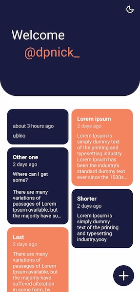
As soon as we start having multiple notes, it can be annoying to look for a specific one. This means it's time to implement a search feature !
Search feature
This will be straightforward since everything is already in place.
Create a new component src/components/SearchBar.tsx
// src/components/SearchBar.tsx
// ...imports
interface SearchBarInterface {
  value: string;
  onChangeText: (next: string) => void;
  placeholder: string;
}

const PADDING_TOP_BAR = 16;

export default function SearchBar({
  value,
  onChangeText,
  placeholder,
}: SearchBarInterface) {
  return (
    <StyledView
      p={20}
      pt={0}
      width='100%'
      position='absolute'
      borderBottomLeftRadius={24}
      borderBottomRightRadius={24}
      top={HEADER_FULL_HEIGHT + PADDING_TOP_BAR}
    >
      <StyledView
        bg='accent'
        borderRadius={8}
        flexDirection='row'
        justifyContent='flex-start'
        alignItems='center'
        height={40}
      >
        <Feather
          name='search'
          size={20}
          color='black'
          style={styles.iconStart}
        />
        <TextInput
          style={styles.input}
          placeholder={placeholder}
          value={value}
          onChangeText={onChangeText}
        />
        {value?.length > 0 && (
          <Feather
            name='x'
            size={24}
            color='black'
            style={styles.iconEnd}
            onPress={() => onChangeText('')}
          />
        )}
      </StyledView>
    </StyledView>
  );
}

const styles = StyleSheet.create({
  iconStart: {
    marginLeft: 8,
  },
  iconEnd: {
    marginRight: 8,
  },
  input: {
    flex: 1,
    fontSize: 16,
    marginLeft: 8,
    paddingVertical: 4,
  },
});
Finally, add it to our Home page
// src/pages/Home.tsx
// ...imports

const StyledScrollView = styled.ScrollView<LayoutProps & SpaceProps>(
  compose(layout, space)
);

export type HomeProps = NativeStackNavigationProp<HomeStackParamList, 'Home'>;

+const SEARCH_INPUT_HEIGHT = 40;
const PADDING_TOP_CONTENT = 16;

export default function Home() {
  const { notes } = useNote();
  const [isLoading, setIsLoading] = useState<boolean>(true);
  const [filteredNotes, setFilteredNotes] = useState<Note[]>([]);
+ const [search, setSearch] = useState<string>('');
+ const debouncedSearch = useDebounce<string>(search, 500);
  const { primary } = useTheme().colors;

  // allow to set local state in sync
  useEffect(() => {
    // avoid running it before notes initialized
    if (!notes) return;
    setFilteredNotes(notes);
    setIsLoading(false);
+    setSearch('');
  }, [notes]);

  // run each time debouncedSearch change
+  useEffect(() => {
+    if (!notes) return;
+    const nextData = notes.filter((note) =>
+      note.title.toLocaleLowerCase().includes(search.toLocaleLowerCase())
+    );
+    setFilteredNotes(nextData);
+  }, [debouncedSearch]);

  return (
    <StyledView flex={1} alignItems='center' backgroundColor='background'>
      <StyledScrollView
        width='100%'
        p={16}
        pb={0}
        contentContainerStyle={{
          paddingTop:
+            HEADER_FULL_HEIGHT + SEARCH_INPUT_HEIGHT + PADDING_TOP_CONTENT,
        }}
      >
        {isLoading ? (
          <ActivityIndicator size='large' color={primary} />
        ) : (
          <MasonryList
            notes={filteredNotes}
-             search={''}
+            search={search}
            userHasNotes={!!notes && notes?.length > 0}
          />
        )}
      </StyledScrollView>
+      {notes && notes?.length > 0 && (
+        <SearchBar
+          value={search}
+          onChangeText={setSearch}
+          placeholder='Search a title...'
+        />
+      )}
      <CreateButton />
      <Header />
    </StyledView>
  );
}
Create a few more notes and try your search feature.
You made it!
Conclusion
In this article, we see how to manage your app logic and design to provide your users a nice-looking and using tool. We created a note-taking app but the most important thing is that the concept of global state your learned can be apply to any application.
Next time, in the last article of this series, I will show you how to bring life to this application using animations (reanimated 2).
Congratulations for following until the end! Do not hesitate to subscribe to my newsletters and to join me on twitter to follow my daily tips and tricks.
See you soon! 👋
- Yannick


