How to efficiently set up your react native project
How to create a scalable react native app - Part I

Creating a new app is a long and complex process that discourages many developers. Keeping your code simple and maintainable are the keys to give your project a better chance of success. In this series, I will show you my way to implement this through a complete step-by-step example.
Disclaimer: This series is composed of three articles. Each part will focus on a different aspect of app development.
This first article of the series is dedicated to the project configuration. Too many times, developers (I was like that too 🤫), do not take the time to make a good project configuration and start coding too quickly. Experience taught me that it is better to spend time at the beginning setting up a pertinent and scalable configuration. In many ways, this will prevent misconceptions, coding errors, rework and other troubles that can happen along the way.
At the end of this series, you will be able to create your own high-quality app with a solid project configuration, consistent design system, data manipulations, and animations.
If you get stuck, you can find a link to my github repo at the end of this article. You can also leave a comment, I will be happy to answer.
What are we going to build?
If like me, you like to learn by doing this tutorial is for you. Before starting, I suggest you to read it once to understand the main concern and then start coding at the same time.
Prerequisites
This tutorial is beginner-friendly, however, to follow it flawlessly you should already have some react native and expo basics. If not please read the getting started doc for react native and expo first. If you have any questions, leave a comment or send me a message on Twitter.
Create an expo project
Open your favorite terminal and let's get started!
If you haven't already, install expo-cli by running :
npm install --global expo-cli
Then, go ahead and create a new expo project :
expo init react-native-note && cd react-native-note
(you can choose another name if you prefer 😄)
At the question choose a template choose blank (TypeScript)
Typescript is helpful to prevent development errors and so is a huge step in the right direction to become more scalable and productive.
Congrats your project is created!
Try to run it with expo start to ensure everything is working properly.
Configuring typescript
Open your favorite IDE, in my case (like almost everyone) I will use VS Code.
Mac pro tip:
CMD + Pallow searching for a file in the current project
At the root level of the project, find a file called tsconfig.json and past the content bellow inside :
{
  "extends": "expo/tsconfig.base",
  "compilerOptions": {
    "strict": true,
    "esModuleInterop": true,
    "isolatedModules": true,
    "allowSyntheticDefaultImports": true, // Allow default imports from modules without default export
    "jsx": "react-native", // Specify JSX code generation
    "skipLibCheck": true,
    "moduleResolution": "node", // Specify module resolution strategy
    "noEmit": true, // not emit outputs
    "target": "esnext", // Specify ECMAScript target version
    "baseUrl": ".",
    // create paths to our futur modules
    "paths": {
      "@components/*": ["./src/components/*"],
      "@navigation/*": ["./src/navigation/*"],
      "@contexts/*": ["./src/contexts/*"],
      "@models/*": ["./src/models/*"],
      "@pages/*": ["./src/pages/*"]
    }
  },
  "include": ["./src/**/*"]
}
Project architecture
By default, you will have this project architecture :
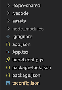
From here, react native doesn't impose any architecture for your code, technically you could create your components directly at the root. However, it is a good practice to organize your code by concern to improve readability, reusability and debugging.
Let's create some folders.
VS Code tips: you can create parent and child folders at once by specifying their relative path. For example from our root click
new folderand inputsrc/pagesthis will create bothsrcandpagesfolders (works also with files).
At the root of our project, create an src folder where will live your app. Inside src, create multiple folders called pages (no need to specify what is inside I guess 😅), components (for child components), hooks, contexts, navigation, and models (for typescript interfaces).
Async storage
We will use async storage to persist user preferences like the selected theme. Install it with the following command :
expo install @react-native-async-storage/async-storage
Add a file src/models/storage.ts, where we will define our storage keys :
using an enum prevent typos
export enum StorageKeys {
  USE_DARK_THEME = 'useDarkTheme'
}
Design system
Dependencies
Defining your design system is one of the most important steps to give your app consistent and neat user visual effects. To handle it in the best way, we will use styled-components, this CSS-in-JS framework provides a simple and flexible way to create react components with the ability to define style based on component props. Link to documentation
npm i styled-system styled-components && npm i --save-dev @types/styled-system @types/styled-components @types/styled-components-react-native babel-plugin-styled-components babel-plugin-module-resolver
and update your babel.config.js file as follow :
module.exports = function (api) {
  api.cache(true);
  return {
    presets: ['babel-preset-expo'],
    plugins: [
      'babel-plugin-styled-components',
      [
        'module-resolver',
        {
          root: ['./src'],
          extensions: ['.ios.js', '.android.js', '.js', '.ts', '.tsx', '.json'],
          alias: {
            '@components': './src/components',
            '@navigation': './src/navigation',
            '@contexts': './src/contexts',
            '@models': './src/models',
            '@pages': './src/pages',
          },
        },
      ],
    ],
  };
};
You may have noticed the aliases, you need to configure them both in typescript (we did it above) and babel. Thanks to it, instead of using absolute imports you can use our aliases. For example
import SomeComponent from './src/components/SomeComponent'will beimport SomeComponent from '@components/SomeComponent'
Run your app with expo start -c to clear your cache and take our changes into consideration.
Styled components has its own syntax, creating a simple full size centered View with background color would be :
// simple example of styled-components
import styled from 'styled-components/native'

const StyledView = styled.View`
  background-color: ${(props) => props.color};
  justify-content: center;
  align-items: center;
  flex: 1;
`;

// then use it like any other component :
<StyledView color=”red”>{...}</StyledView>
In addition to styled-components, we will take advantage of styled-system. This library will extend styled-components improving our style structure by adding styling props directly to your react component. styled-system allow also to control styles based on a global theme object (scales, colors, layouts...). This will upgrade both our design consistency and our code reusability and then will allow us to iterate quickly. Link to documentation
For reference, the same component as above using styled-system will be :
// simple example of styled-components and styled-system
import styled from 'styled-components/native'
import {
  compose,
  color,
  ColorProps,
  flex,
  flexbox,
  FlexboxProps,
  FlexProps
} from 'styled-system'

// get our component typed and enjoy autocompletion
type StyledViewProps = ColorProps & FlexProps & FlexboxProps;

const StyledView = styled.View<StyledViewProps>(
  compose(
    color,
    flex,
    flexBox
  )
);
// then use it like :
<StyledView
  flex={1}
  justifyContent='center'
  alignItems='center'
  backgroundColor='red'
>{...}</StyledView>
Pretty easy to read right?
you can even shorten the syntax:
backgroundColorbecomebg,marginbecomem... but I wanted to keep it simple to understand.
But wait, the real magic happens when you start using theming!
Theming
Inside src/models, create a file named styled.d.ts. This file will extend the empty DefaultTheme interface provided by styled-components to contain our custom theme :
// src/models/style.d.ts
import 'styled-components';

declare module 'styled-components' {
  export interface DefaultTheme {
    fontSizes: number[];
    space: number[];
    colors: {
      primary: string;
      secondary: string;
      background: string;
      text: string;
      accent: string;
    };
  }
}
Then continue by creating a Theme.ts into your src folder and paste the following content inside :
// src/Theme.tsx
import { DefaultTheme } from 'styled-components/native';

// you can play with the colors here
const lightTheme: DefaultTheme = {
  fontSizes: [12, 14, 16, 20, 24, 32, 36], // could also be defined as em
  space: [0, 4, 8, 16, 32, 64],
  colors: {
    primary: '#1A1B41',
    secondary: '#F4845F',
    background: '#FEFEFF',
    text: 'black',
    accent: '#d9dbda',
  },
};

const darkTheme: DefaultTheme = {
  fontSizes: [12, 14, 16, 20, 24, 32, 36],
  space: [0, 4, 8, 16, 32, 64],
  colors: {
    primary: '#7FC29B',
    secondary: '#334756',
    background: '#272838',
    text: 'white',
    accent: '#d9dbda',
  },
};

enum Theme {
  LIGHT = 'light',
  DARK = 'dark',
}

export { lightTheme, darkTheme, Theme };
As you can see, we use the DefaultTheme interface we defined just before to create two themes with different values (especially for colors). We also create an enum to identify each theme and we export everything to be able to use it elsewhere.
Now that we have our themes, we will make use of the React context API to make them available across all our components. styled-components provide a context to expose the selected theme, however, we would like to extend this to be able to switch between themes.
To do this, we will wrap the ThemeProvider from styled-components. Inside src/contexts add a file called ThemeContext.tsx :
// src/contexts/ThemeContext.tsx
import AsyncStorage from '@react-native-async-storage/async-storage';
import React, { createContext, useEffect, useState } from 'react';
import { Alert, useColorScheme } from 'react-native';
import { ThemeProvider as StyledThemeProvider } from 'styled-components/native';
import { StorageKeys } from '@models/storage';
import { darkTheme, lightTheme } from '../Theme';

interface IThemeContext {
  isDarkTheme: boolean | undefined;
  switchTheme: () => void;
}

// create context with default value
export const ThemeContext = createContext<IThemeContext>({
  isDarkTheme: undefined,
  switchTheme: () => {},
});

const ThemeProvider = ({ children }: { children: React.ReactNode }) => {
  // get from OS user prefered theme
  const colorScheme = useColorScheme();
  const [isDark, setIsDark] = useState<boolean>(false);

  // on component first render => check if we have a theme value in async storage
  // otherwise => take user prefered theme
  useEffect(() => {
    const setUserTheme = async () => {
      try {
        const useDarkMode = await AsyncStorage.getItem(StorageKeys.USE_DARK_THEME);
        let result = colorScheme === 'dark';
        if (useDarkMode !== null) {
          result = JSON.parse(useDarkMode);
        }
        setIsDark(result);
      } catch {
        Alert.alert('An error occured getting your saved theme');
      }
    };
    setUserTheme();
  }, []);

  // update theme & set the new value to async storage
  const switchTheme = async () => {
    setIsDark((prev) => !prev);
    try {
      await AsyncStorage.setItem(
        StorageKeys.USE_DARK_THEME,
        JSON.stringify(!isDark)
      );
    } catch {
      Alert.alert('An error occured while updating theme');
    }
  };

  // wrap `styled-components` provider with our own one
  // according to `isDark` provide the corresponding theme from `Theme.ts`
  // every `children` will have access to `isDarkTheme`, `switchTheme` and `theme`
  return (
    <ThemeContext.Provider
      value={{
        isDarkTheme: isDark,
        switchTheme,
      }}
    >
      <StyledThemeProvider theme={isDark ? darkTheme : lightTheme}>
        {children}
      </StyledThemeProvider>
    </ThemeContext.Provider>
  );
};

export default ThemeProvider;
All you have to do now is to wrap all your app within this context. After that, every components can have access to the current theme through the useTheme hook. Even better, our styled components can directly use theme variables in their props. Update your App.tsx to use it :
colororbackgroundColorprops can now use any colors from our theme (you can still input color that doesn't exist in theme like #6DD8AF or "red" for example).
marginpaddingprops use values from "space" array in our theme. For example when you setmargin={2}the value "2" represents the index in this array. If you go further than the available indexes, the value will be used as pixels.
fontSizeuse values from "fontSizes" array in our theme. Just likemarginandpaddingit will be interpreted as index in the array. Check thestyled-systemdoc out for more.
// App.tsx
import { StatusBar } from 'expo-status-bar';
import React from 'react';
import { SafeAreaView, StyleSheet, Text } from 'react-native';
import styled from 'styled-components/native';
import {
  color,
  ColorProps,
  compose,
  flex,
  flexbox,
  FlexboxProps,
  FlexProps,
} from 'styled-system';
import ThemeProvider from '@contexts/ThemeContext';

type StyledViewProps = ColorProps & FlexProps & FlexboxProps;
const StyledView = styled.View<StyledViewProps>(compose(color, flex, flexbox));

export default function App() {
  return (
    <SafeAreaView style={styles.container}>
      <ThemeProvider>
        <StyledView
          flex={1}
          justifyContent='center'
          alignItems='center'
          backgroundColor='primary'
        >
          <Text style={styles.title}>Hello from App</Text>
        </StyledView>
        <StatusBar style='auto' />
      </ThemeProvider>
    </SafeAreaView>
  );
}

const styles = StyleSheet.create({
  container: {
    flex: 1,
  },
  title: {
    color: 'white',
  },
});
Refresh your app to enjoy your first themed view!
Generic components
To avoid re-declaring the most used components (View and Text) in every page we are going to create generic components to reuse.
In src/components create two components StyledView.tsx and StyledText.tsx :
// src/components/StyledView.tsx
import styled from 'styled-components/native';
import {
  color,
  ColorProps,
  compose,
  flex,
  flexbox,
  FlexboxProps,
  FlexProps,
  layout,
  LayoutProps,
  position,
  PositionProps,
  space,
  SpaceProps,
  borderRadius,
  BorderRadiusProps
} from 'styled-system';

// space allow to use padding, margin...
// layout allow to use width, height...
type StyledViewProps = ColorProps &
  SpaceProps &
  PositionProps &
  FlexProps &
  FlexboxProps &
  LayoutProps &
  BorderRadiusProps;

const StyledView = styled.View<StyledViewProps>(
  compose(color, space, position, flex, flexbox, layout, borderRadius)
);

export default StyledView;
import styled from 'styled-components/native';
import {
  color,
  ColorProps,
  compose,
  space,
  SpaceProps,
  typography,
  TypographyProps,
} from 'styled-system';

// typography allow to change font size, style etc
type StyledTextProps = ColorProps & SpaceProps & TypographyProps;

const StyledText = styled.Text<StyledTextProps>(
  compose(color, space, typography)
);

export default StyledText;
As you can see, we pass common used style properties to our component via the compose helper function. Thanks to it we will now have access to those properties directly through the component props
Ok, so let's use it!
Prepare navigation
For this app, we are going to use a famous library called React Navigation. It allows to easily handle multiple navigation patterns such as tabs, drawers, stacks...
In our case, we are going to use a stack. If you want to learn more about other possibilities, leave a comment and I will consider creating a dedicated article.
Install the library and its dependencies with the following command :
npm install @react-navigation/native @react-navigation/native-stack && expo install react-native-screens react-native-safe-area-context
While installing, create two "placeholder" components respectively named Home.tsx and NoteEdit.tsx inside src/pages folder.
Pro tips: I'm using the
ES7 React/Redux/GraphQL/React-Native snippetsextension to speed up the creation process. With it, add a new file and writernfinside to create a functional component.
// src/pages/Home.tsx
import React from 'react';
import StyledText from '@components/StyledText';
import StyledView from '@components/StyledView';

export default function Home() {
  const { switchTheme } = useContext(ThemeContext);

  return (
    <StyledView
      flex={1}
      justifyContent='center'
      alignItems='center'
      backgroundColor='primary'
    >
      <StyledText color='white'>Hello from Home</StyledText>
      <StyledText color='secondary' mt={3} onPress={switchTheme}>
        Click to switch theme
      </StyledText>
    </StyledView>
  );
}
// src/pages/NoteEdit.tsx
import React from 'react';
import StyledText from '@components/StyledText';
import StyledView from '@components/StyledView';

export default function NoteEdit() {
  return (
    <StyledView
      flex={1}
      justifyContent='center'
      alignItems='center'
      backgroundColor='background'
    >
      <StyledText color='text'>Hello from NoteEdit</StyledText>
    </StyledView>
  );
}
With these two components, you get a first glimpse of why a good project setup could improve your productivity. Our components are much more readable and concise.
Once it's done, create a file src/navigation/HomeStack.tsx. In this file, we are going to create our main stack navigator with our two screens.
// src/navigation/HomeStack.tsx
import { createNativeStackNavigator } from '@react-navigation/native-stack';
import React from 'react';
import { useTheme } from 'styled-components/native';
import { Note } from '@models/note';
import StyledView from '@components/StyledView';
import Home from '@pages/Home';
import NoteEdit from '@pages/NoteEdit';

// type navigation + each route params
export type HomeStackParamList = {
  Home: undefined;
  NoteEdit: { id: number; title: string };
};

// using type avoid typo in route name by providing autocomplete
const HomeStack = createNativeStackNavigator<HomeStackParamList>();

export default function HomeStackNavigator() {
  const { background, text } = useTheme().colors;
  // by default => go to Home
  // wrapping everything in a view with bg color avoid
  // white flickering in dark mode
  return (
   <StyledView flex={1} backgroundColor='background'>
    <HomeStack.Navigator initialRouteName="Home" >
      <HomeStack.Screen
        name='Home'
        component={Home}
        options={() => ({
          headerShown: false,
        })}
      />
      <HomeStack.Screen
        name='NoteEdit'
        component={NoteEdit}
        options={({ route }) => ({
          headerStyle: { backgroundColor: background },
          headerTintColor: text,
          headerTitle: route.params.title,
        })}
      />
    </HomeStack.Navigator>
   </StyledView>
  );
}
And then add an src/navigation/index.tsx where we will create our main navigation container :
// src/navigation/index.tsx
import { NavigationContainer } from '@react-navigation/native';
import React from 'react';
import HomeStackNavigator from '.@navigation/HomeStack';

export default function Navigation() {
  return (
    <NavigationContainer>
      <HomeStackNavigator />
    </NavigationContainer>
  );
}
Finally, we need to use this component in our App.tsx
import { StatusBar } from 'expo-status-bar';
import React from 'react';
import { SafeAreaView, StyleSheet } from 'react-native';
import ThemeProvider from '@contexts/ThemeContext';
import Navigation from '@navigation/index';
-import {
-  color,
-  ColorProps,
-  compose,
-  flex,
-  flexbox,
-  FlexboxProps,
-  FlexProps,
-} from 'styled-system';

-type StyledViewProps = ColorProps & FlexProps & FlexboxProps;
-const StyledView = styled.View<StyledViewProps>(compose(color, flex, flexbox));

export default function App() {
  return (
    <SafeAreaView style={styles.container}>
      <ThemeProvider>
-        <StyledView
-          flex={1}
-          justifyContent='center'
-          alignItems='center'
-          backgroundColor='primary'
-        >
-          <Text style={styles.title}>Hello from App</Text>
-        </StyledView>
+       <Navigation />
        <StatusBar style='auto' />
      </ThemeProvider>
    </SafeAreaView>
  );
}

const styles = StyleSheet.create({
  container: {
    flex: 1,
  },
-  title: {
-    color: 'white',
-  },
});
Run your app, you should see your Home page, try to click on the "click to switch theme". Congrats you successfully setup your project!
Your favorite theme is even persisted in your mobile storage 🤗
Conclusion
This part wasn't the funniest, but having all of this already configured will really be a game changer for the rest of the tutorial. This will allow us to iterate quickly while keeping our code clean.
In the next part, we will continue by building our pages, components and business logic. We will see among other things how to create a masonry layout and a search feature.
I hope you enjoy and learn something interesting with this tutorial. If you have any suggestion / question feel free to leave a comment, I will be happy to answer it.
Subscribe to my newsletter to get notified when the next article comes out!
See you soon! 👋
- Yannick


